DataDash Recipes & Use Cases
DataDash is the command-line swiss-army knife for visualization. Here are practical, real-world recipes you can copy and paste to solve common monitoring and analysis problems.
Recipe Book: Log & Event Analysis
Go beyond `tail -f`. Turn your log streams into interactive dashboards to spot trends, count errors, and understand performance in real-time.
Get an instant overview of an Apache access log by analyzing status codes and traffic volume. The `jq` filter is used here to convert the legacy Apache log format into modern JSONL format on the fly.
# The while loop simulates a live stream for the GIF effect.
while IFS= read -r line; do
  echo "$line"
  sleep 0.05
done < apache_logs.log | \
jq -R -c 'capture("(?<ip>\\S+) \\S+ \\S+ \\[(?<ts>.*?)\\] \\x22(?<method>\\S+) (?<path>\\S+) \\S+\\x22 (?<status>\\d+) (?<bytes>\\d+) \\x22(?<referrer>.*?)\\x22 \\x22(?<user_agent>.*?)\\x22")' | \
datadash \
    -t "HTTP Status Codes" -w "barchart count by .status" \
    -t "Top Paths" -w "barchart count by .path" \
    -t "Top Referrers" -w "piechart .referrer"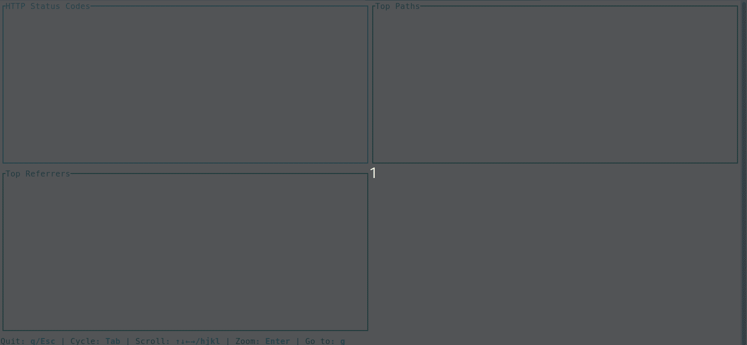
Follow a live log file, filtering for only the error-level events, and visualize the rate per hour to catch incidents as they happen.
datadash app.log.jsonl --follow \
    --where 'level is "error" or level is "critical"' \
    -t "Total Errors" -w "count" \
    -t "Errors per Hour" -w "timeseries .timestamp by 1h"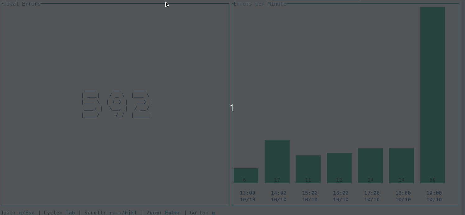
Focus on what's actionable. This recipe filters a live log stream for high-latency events (>800ms) and displays them in a table as they happen, while a line chart tracks the overall latency trend.
datadash api_perf.jsonl --follow \
    --where 'latency_ms > 800' \
    -t "Recent Slow API Calls (>800ms)" -w "table .timestamp .method .path .latency_ms" \
    -t "Overall Latency Trend" -w "linechart .latency_ms"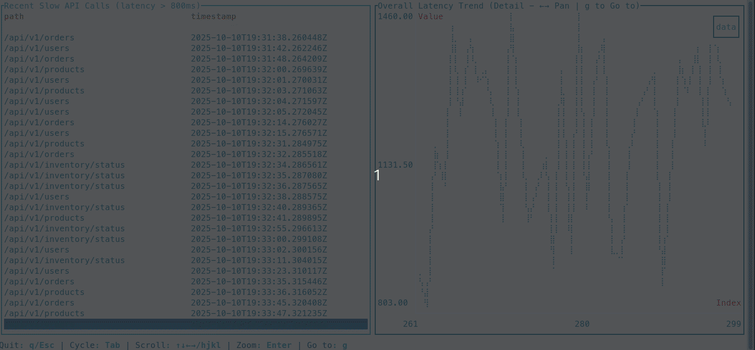
Recipe Book: System & DevOps Monitoring
Create custom, `htop`-style dashboards for any system metric you can output as JSON. Monitor servers, containers, networks, and cloud resources without leaving your terminal.
Go beyond simple metrics and build a custom, real-time process monitor similar to `htop`. This powerful one-liner uses `top` in batch mode to get currently active processes and `ps` to get a total count, combining them into a single dashboard that shows the top 10 most active processes and the total process count, refreshed every two seconds.
# This command combines `ps` and `top` to create a live process dashboard
datadash --interval 2 --watch 'TOTAL=$(ps -e --no-headers | wc -l); TOP=$(top -b -n 1 | awk "BEGIN{p=0} /^[ ]*PID/{p=1; next} p" | head -n 10 | awk '\''{cmd=$12; for (i=13; i<=NF; i++) cmd = cmd " " $i; printf "{\"pid\": %s, \"user\": \"%s\", \"state\": \"%s\", \"cpu\": %s, \"mem\": %s, \"command\": \"%s\"}\n", $1, $2, $8, $9, $10, cmd}'\'' | jq -sc .); echo "{\"total_processes\": $TOTAL, \"top_processes\": $TOP}"' \
  -t "Active Processes" -w "bignumber (.total_processes)" \
  -t "Top 10 Processes (by CPU)" -w "table (.top_processes[])"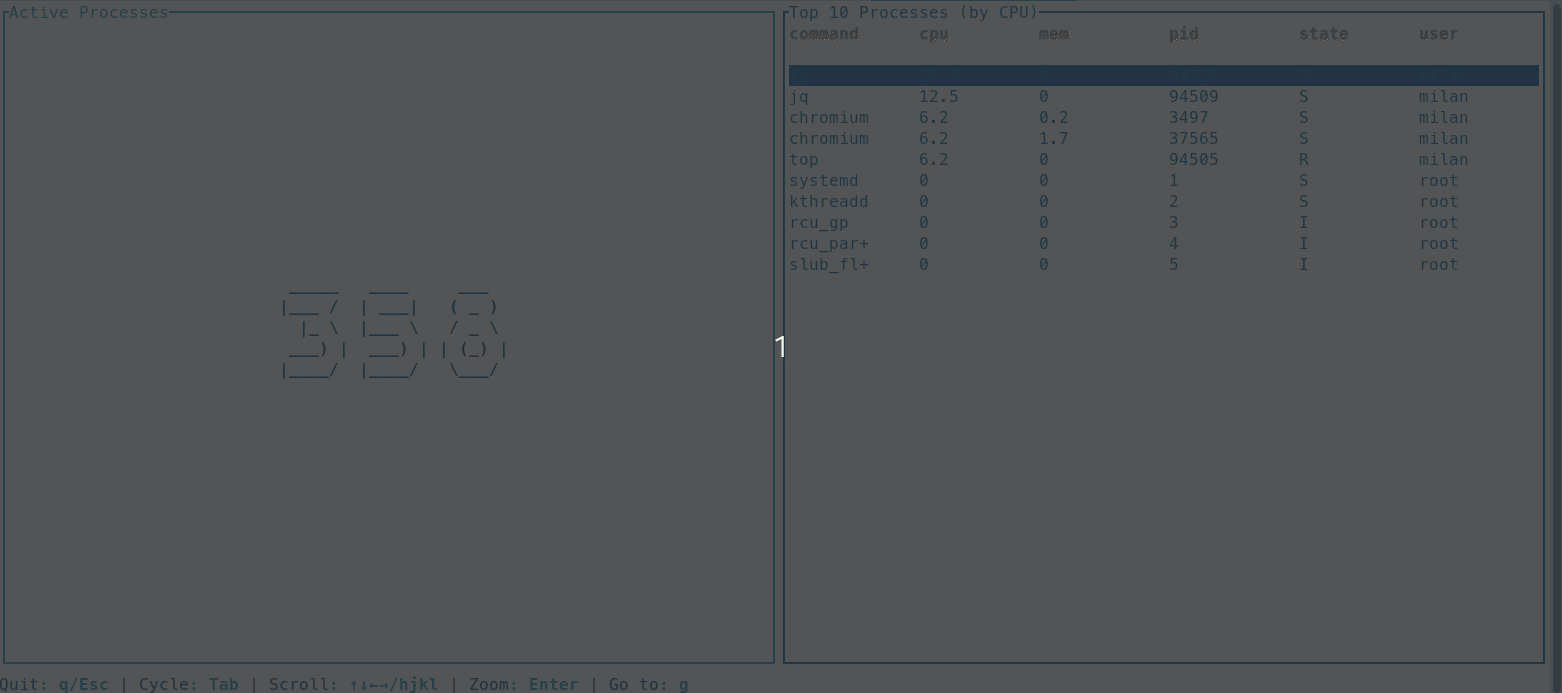
Get a complete, real-time picture of your system's resource health. This recipe uses the `free` and `df` commands to gather memory and disk usage statistics, then visualizes them with gauges for at-a-glance status and a line chart to track memory trends over time. It's an essential dashboard for any server.
# This command combines `free` and `df` to create a live system resource dashboard
datadash --interval 2 --watch 'MEM_JSON=$(free | awk '\''/^Mem:/ {printf "{\"total\": %s, \"used\": %s, \"percent\": %.2f}", $2, $3, $3/$2*100}'\''); DISK_JSON=$(df -k / | awk '\''NR==2 {sub("%","",$5); printf "{\"total\": \"%s\", \"used\": \"%s\", \"percent\": %s}", $2, $3, $5}'\''); echo "{\"memory\": $MEM_JSON, \"disk\": $DISK_JSON}"' \
    --append \
    -t "Memory Usage (%)" -w "gauge (.memory.percent)" \
    -t "Disk Usage (/) (%)" -w "gauge (.disk.percent)" \
    -t "Memory Usage Trend (kb)" -w "linechart (.memory.used)" \
    -t "Disk Usage Trend (kb)" -w "sparkline (.disk.used)"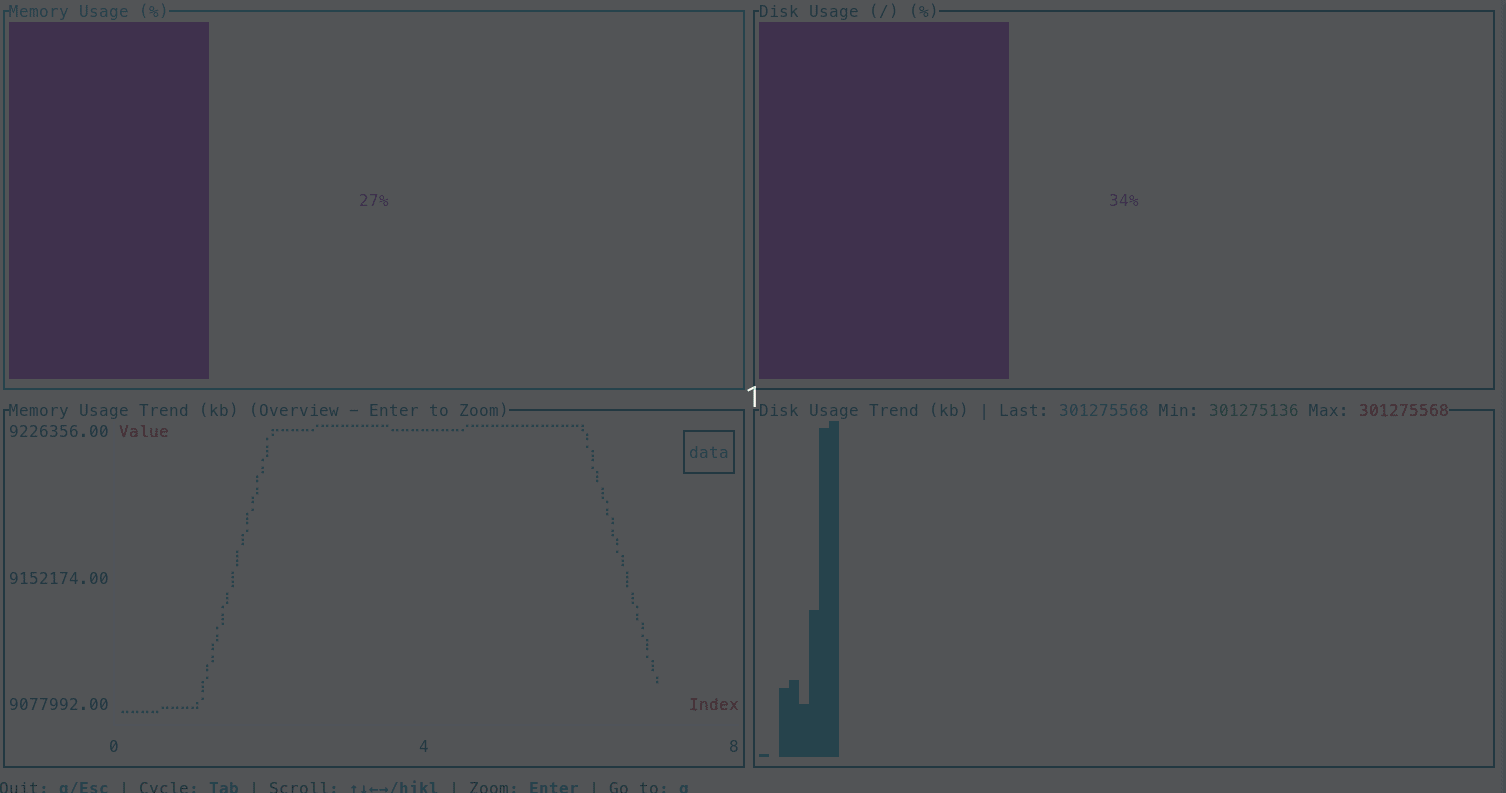
Get immediate feedback on your code's performance by monitoring CPU user time. This recipe provides two complementary views: the total cumulative CPU ticks as a large number, and a sparkline showing the real-time trend of CPU activity, which is crucial for spotting spikes and debugging inefficiencies.
# awk extracts the cumulative user ticks from /proc/stat on Linux systems
datadash --interval 1 --watch 'TICKS=$(awk "/^cpu / {print \$2}" /proc/stat); echo "{\"user_ticks\": $TICKS}"' \
    --append \
    -t "CPU User Ticks (Cumulative)" -w "bignumber .user_ticks" \
    -t "CPU Activity Trend"           -w "sparkline .user_ticks"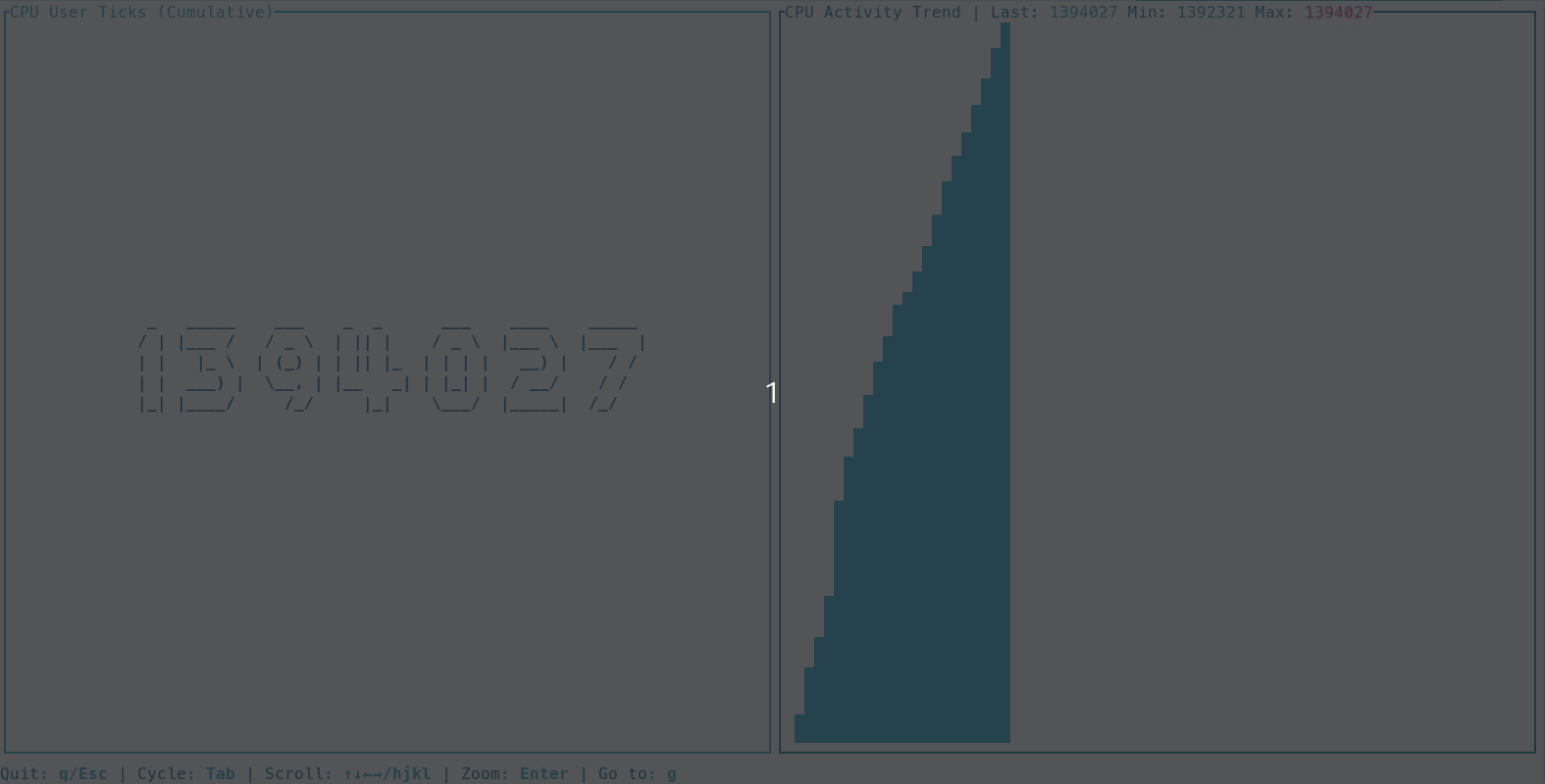
Recipe Book: API & Data Inspection
Whether you're exploring a new API or analyzing a local data file, DataDash lets you instantly visualize any JSON stream to understand its structure and content.
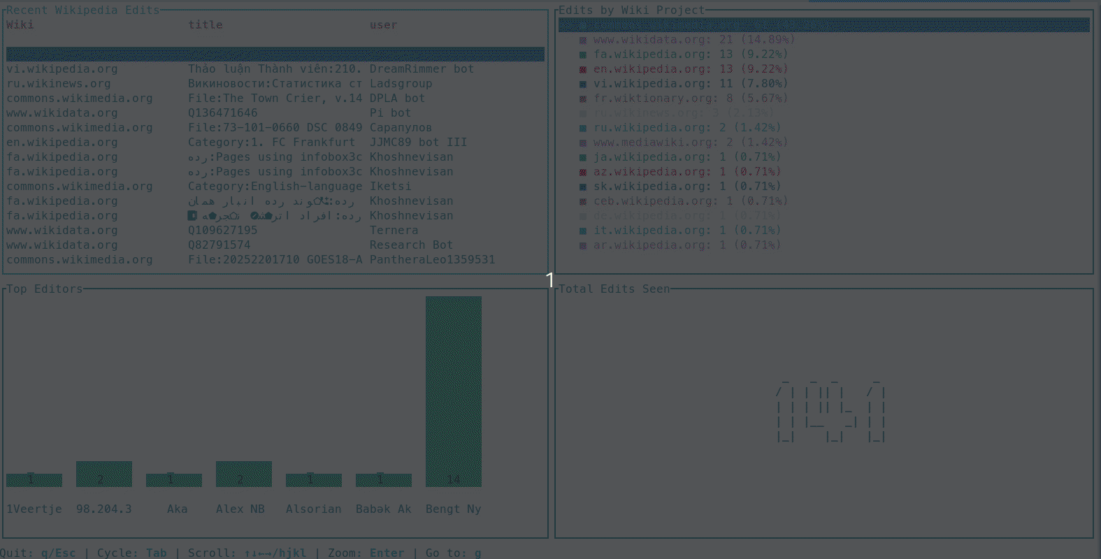
Connect to a high-volume, live event stream like Wikimedia's to get a real-time pulse of global activity. This recipe shows how to parse a Server-Sent Events (SSE) stream and visualize the data as it arrives.
# The awk command extracts clean JSON from the SSE stream format
curl -s https://stream.wikimedia.org/v2/stream/recentchange | \
awk '/^data: / {print substr($0, 7)}' | \
datadash \
    -t "Recent Wikipedia Edits" -w "table .meta.domain as Wiki .title .user" \
    -t "Edits by Wiki Project" -w "piechart .meta.domain" \
    -t "Top Editors" -w "barchart count by .user" \
    -t "Total Edits Seen" -w "count"
Use the --watch feature to repeatedly query a public API (like CoinGecko) and build a comprehensive, real-time dashboard to monitor the top 5 cryptocurrencies. Track live prices, market cap, volume, and intraday performance at a glance.
datadash --interval 15 --watch 'curl -s "https://api.coingecko.com/api/v3/coins/markets?vs_currency=usd&ids=bitcoin,ethereum,binancecoin,solana,ripple&order=market_cap_desc&price_change_percentage=1h" | jq -c ".[]"' \
--layout grid \
-t "Live Crypto Prices" -w 'table .symbol .current_price as price .price_change_percentage_1h_in_currency as "1h %"' \
-t "ETH 24h Range" -w 'gauge (select(.id == "ethereum") | if .high_24h == .low_24h then 50 else (.current_price - .low_24h) / (.high_24h - .low_24h) * 100 end)' \
-t "BTC 24h Range" -w 'gauge (select(.id == "bitcoin") | if .high_24h == .low_24h then 50 else (.current_price - .low_24h) / (.high_24h - .low_24h) * 100 end)' \
-t "1h Price Change (%)" -w "barchart sum .price_change_percentage_1h_in_currency by .symbol" \
-t "Market Cap (USD)" -w "barchart sum .market_cap by .symbol" \
-t "24h Volume" -w "barchart sum .total_volume by .symbol"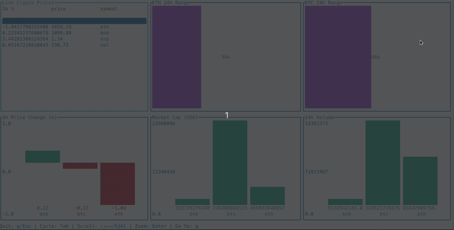
Recipe Book: Business Intelligence & Data Analysis
Instantly turn local data files like CSVs or JSONL into interactive Business Intelligence dashboards to analyze sales, user behavior, and other key metrics.
This recipe shows how to take a large local CSV file of sales data, convert it to JSONL, clean it with `jq`, and pipe it into an 8-widget dashboard that provides a complete overview of the business activity.
# Step 1: First, convert a sample of your CSV to the required JSONL format.
# This example is tailored for a sales data file named 'kz.csv'.
head -n 5000 kz.csv | awk -F, 'NR>1 {printf "{\"event_time\":\"%s\",\"order_id\":%s,\"product_id\":%s,\"category_id\":%s,\"category_code\":\"%s\",\"brand\":\"%s\",\"price\":%s,\"user_id\":%s}\\n", $1,$2,$3,$4,$5,$6,$7,$8}' > kz.jsonl

# Step 2: Stream the JSONL file into a live DataDash dashboard.
# The jq command cleans the data by handling empty fields and simplifying categories.
while IFS= read -r line; do
  echo "$line"
  sleep 0.01
done < kz.jsonl | \
jq -c '.brand |= if . == "" then "(unknown)" else . end | .category_code |= if . == "" then "(unknown)" else (split(".")[0]) end' | \
datadash --layout grid \
    -t "Live Sales Feed" -w "table .event_time .brand .category_code .price" \
    -t "Total Sales Count" -w "count" \
    -t "Sales by Top-Level Category" -w "barchart count by .category_code" \
    -t "Top Brands (by Sales Count)" -w "piechart .brand" \
    -t "Last Sale ($)" -w "bignumber .price" \
    -t "Price Trend" -w "sparkline .price" \
    -t "Revenue by Brand" -w "barchart sum .price by .brand" \
    -t "Sale Value (vs $500)" -w 'gauge ((.price / 500 * 100) | if . > 100 then 100 else . end)'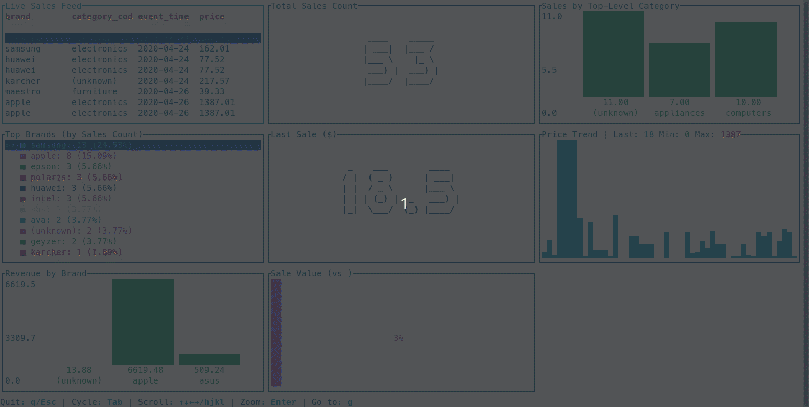
Ready to Visualize Your Data?
Get started for free or unlock the full power of DataDash with a Pro license.
Install DataDash Get Pro License